

/image%2F3361498%2F20190507%2Fob_b9b726_5.gif)
Case Study: School of Mastery, Smarter Me

Background
Smarter Me launched in early 2017 as an online marketplace for parents to search for and book offline enrichment classes. Their mission is to complement the current education system, equipping our future generation with the real-world skills and mental awareness needed to succeed in the decades to come.
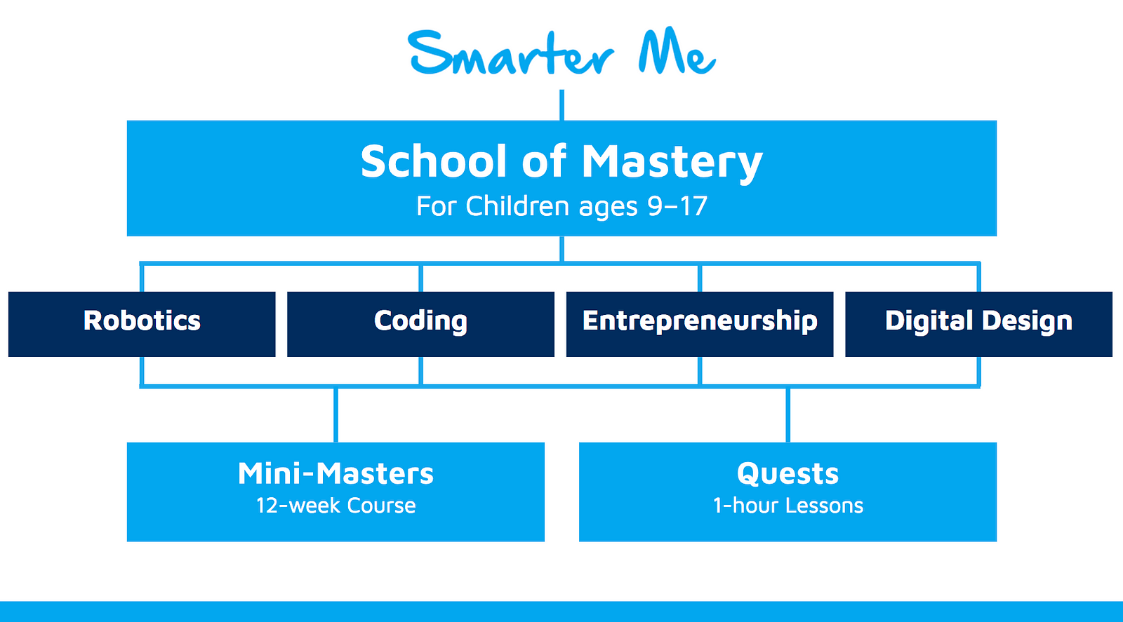
So in 2018, Smarter Me will be launching the School of Mastery — live online classes for children ages 9–17 to discover, develop and master skills in the essential 21st century skills. There will be four Mini-Masters (12-week courses) and Quests (one-hour lessons) — in the fields of Robotics, Coding, Entrepreneurship and Digital Design.
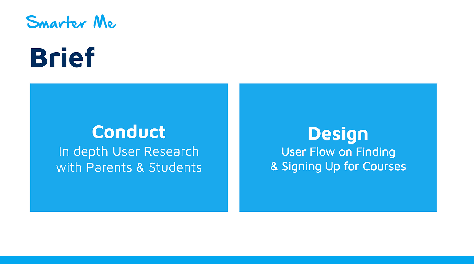
Project Brief
Smarter me would like our team to Conduct in depth user research with parents and students. In addition, they want us to design the user flow on how users find and sign up for courses on the new website.
My Role
I led the wireframe and prototyping of the website as my strength lean towards design but I also contributed in the user research as well as the usability testing of the website.
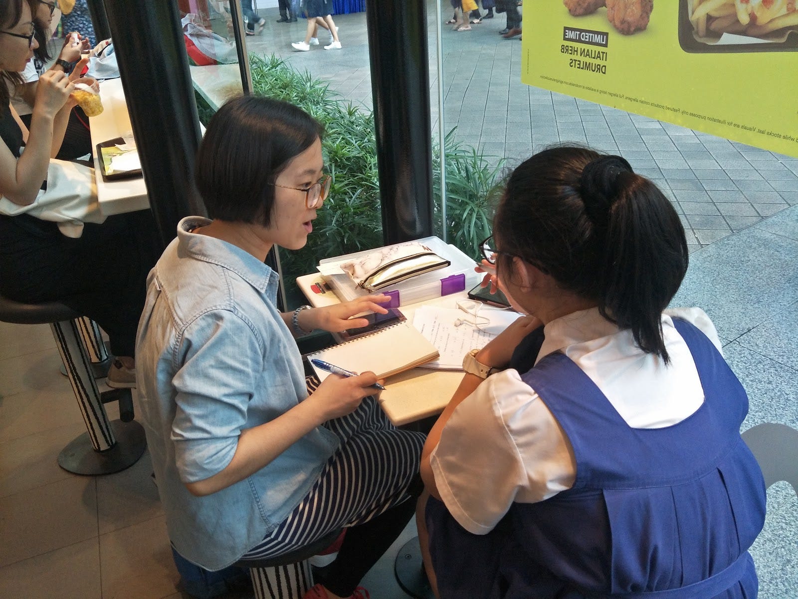
User Research
Throughout this project period, we spoke to a total of 18 users: 6 parents and 12 students. Some of the users were interviewed at a later stage when we conducted our usability test.
Each sessions were conducted face to face, 1 to 1, lasting between 15 to 60 mins. Participants were asked according to a list of sample questions and more questions were asked based on their response.
Our Findings
Most students(regardless of age) get to pick the CCA, subjects, and activities they will like to join. These choices are usually affected by what their friends are joining.
Particularly, Students aged 15–17 are given the freedom to decide what they want to pursue
However, as they are busy with school, they are not proactive in looking for enrichment courses. In fact, some of the students interviewed were asking how these courses can help them get into the JC they want.
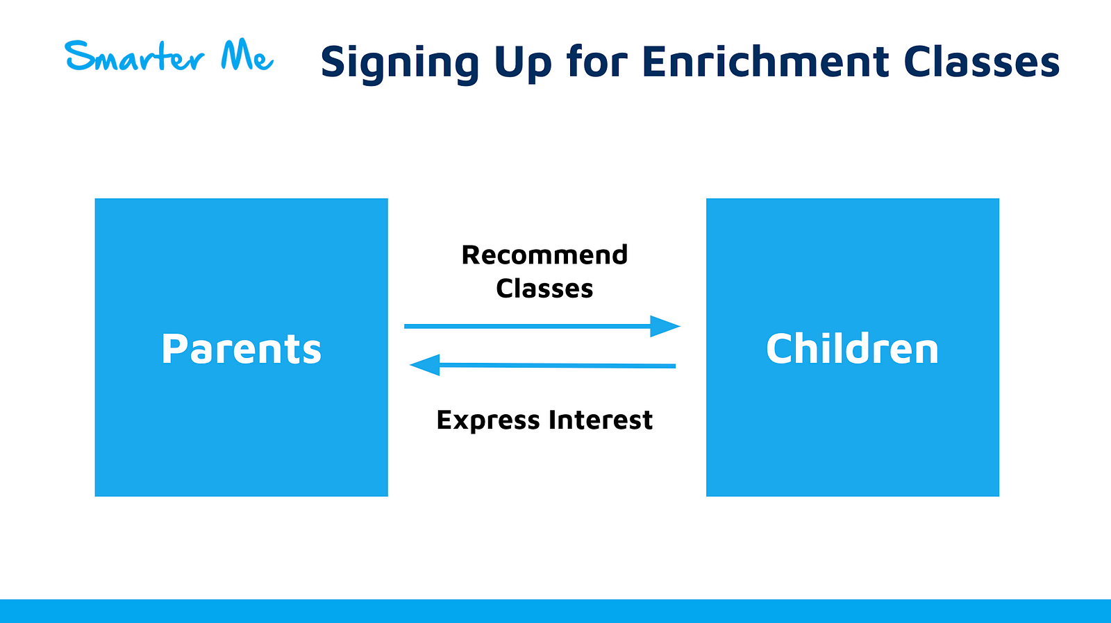
So in most cases parents will provide advice or suggestions on the classes and activities to join. The children must be interested in these courses. Because parents will not want to waste money on classes that the children do not like. They also have the final say in what activities to join. So in this scenario, Smarter Me should reach out to parents to promote the School of Mastery.
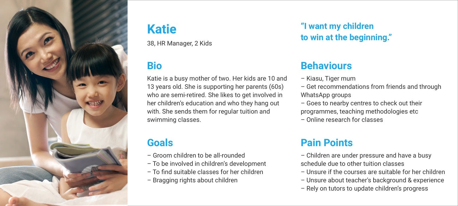
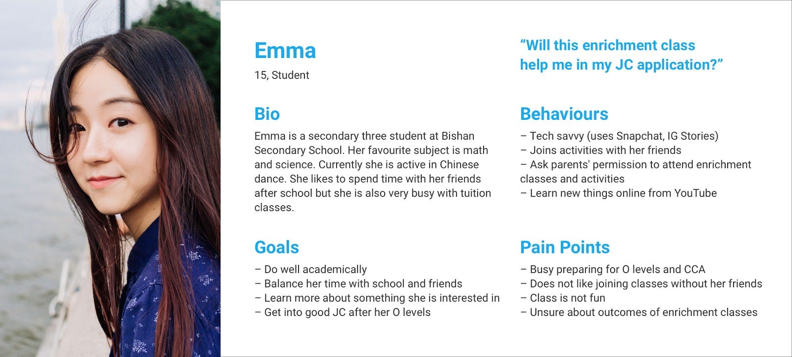
Developing Personas
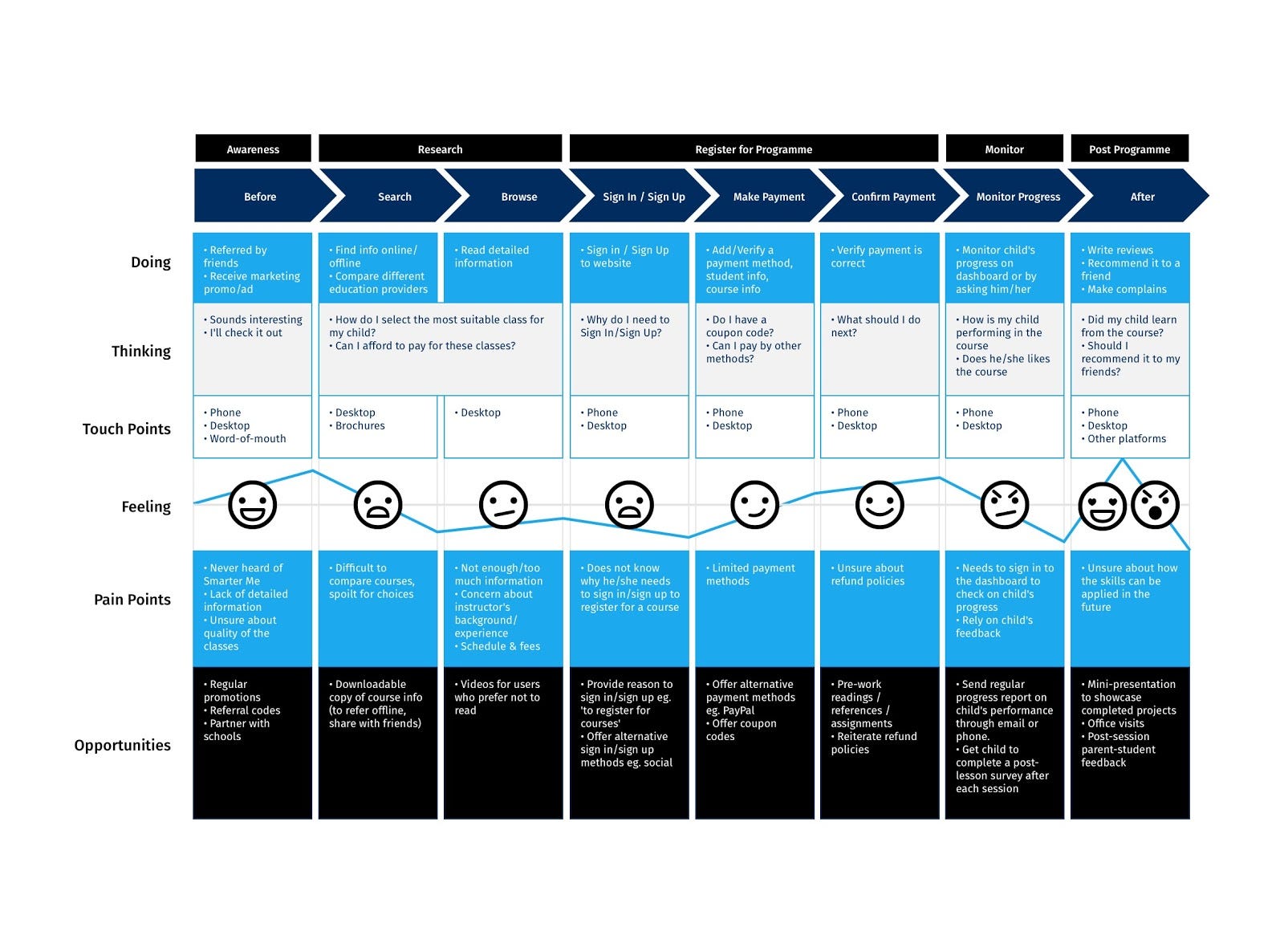
Customer Journey Map
Based on the user personas, we drew out a customer journey map of a typical user of the website.
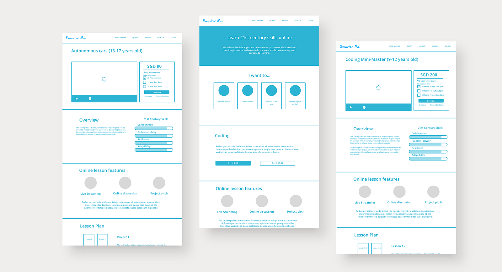
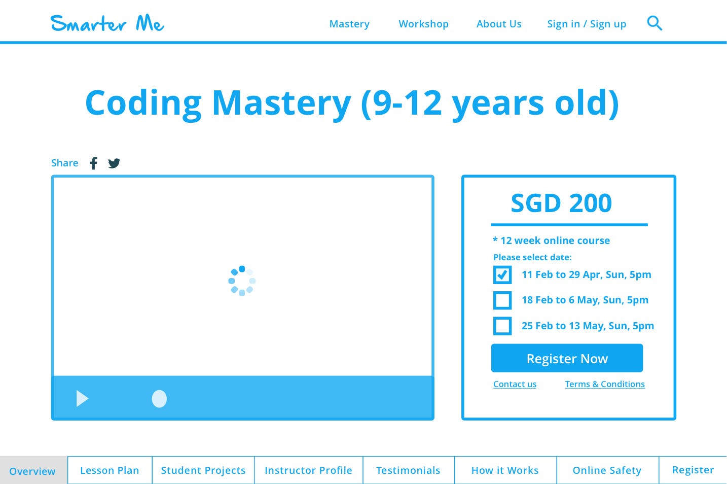
Prototyping
As you can see it is low-fidelity design of the website. Our focus is on usability and user flow rather than the aesthetic look
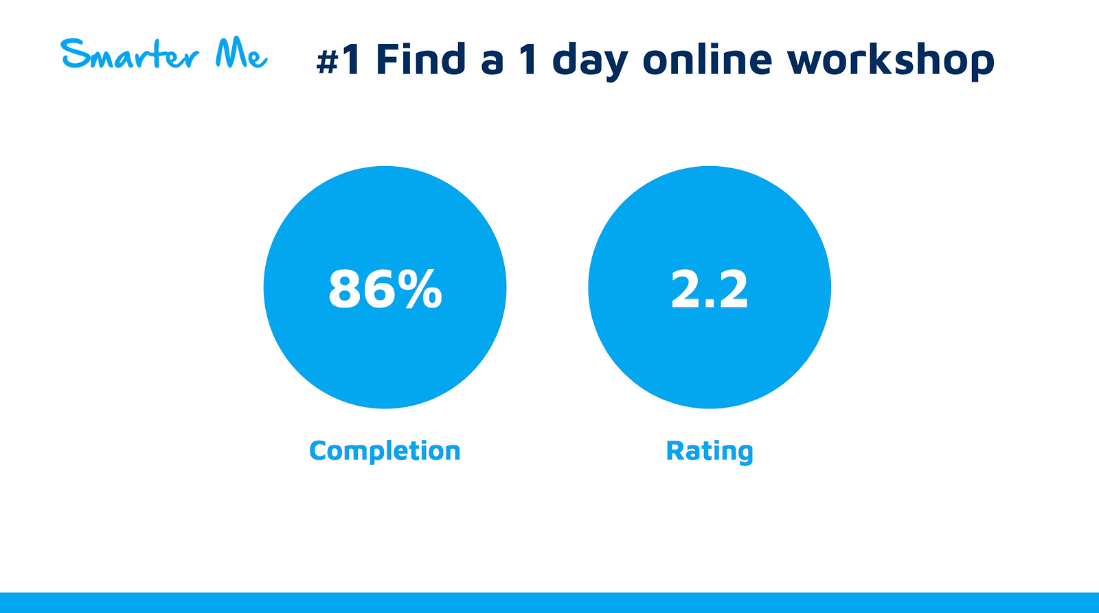
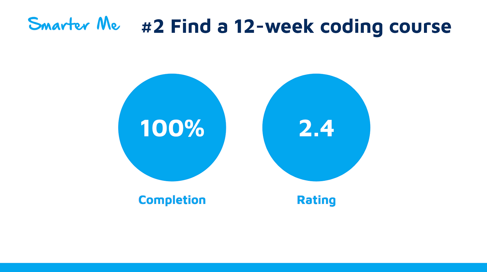
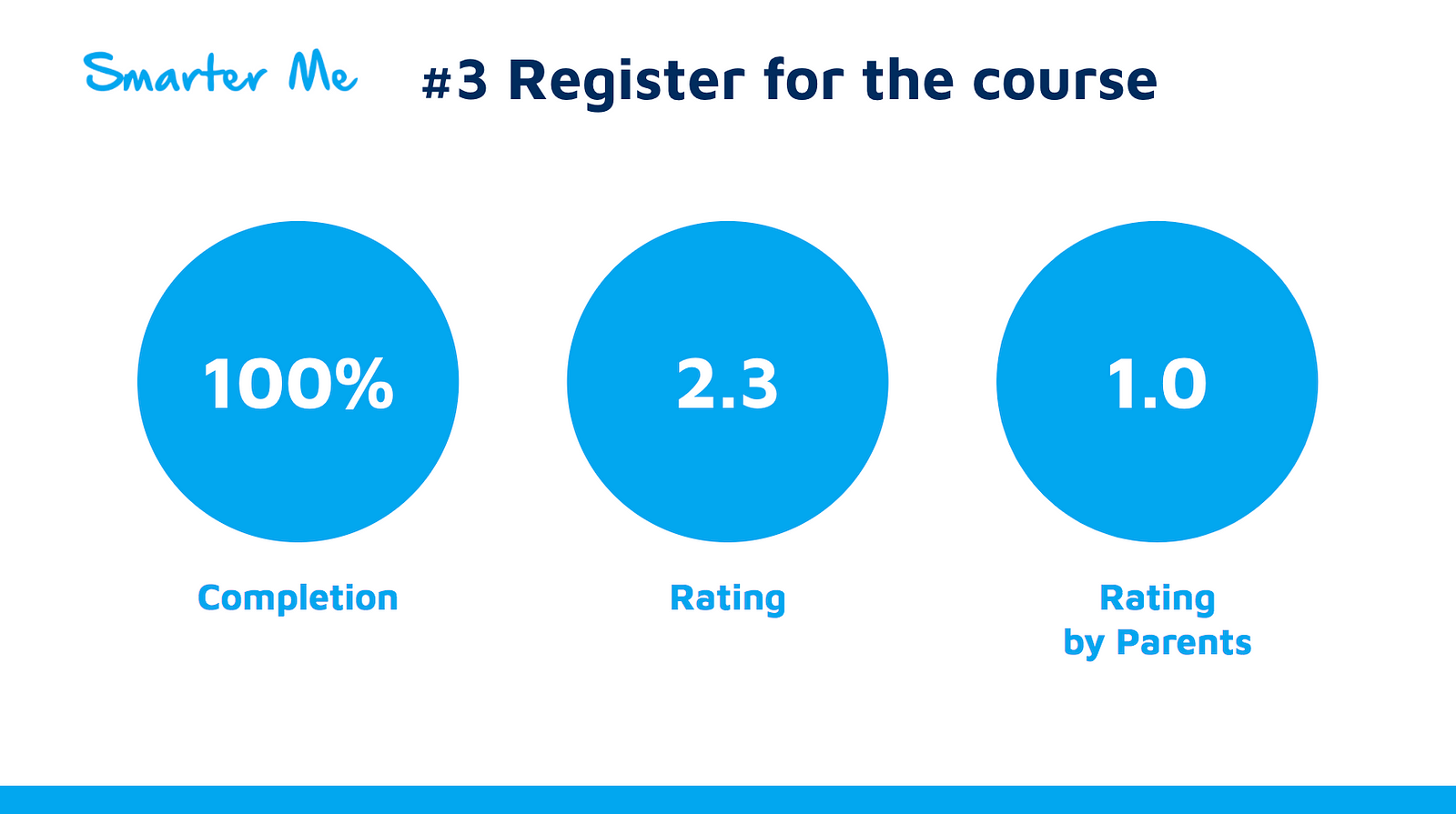
Usability Testing
We conduct user testing to find out if the design makes sense for parents and children before going for Hi-Fi wireframe. These were the task given to our users.
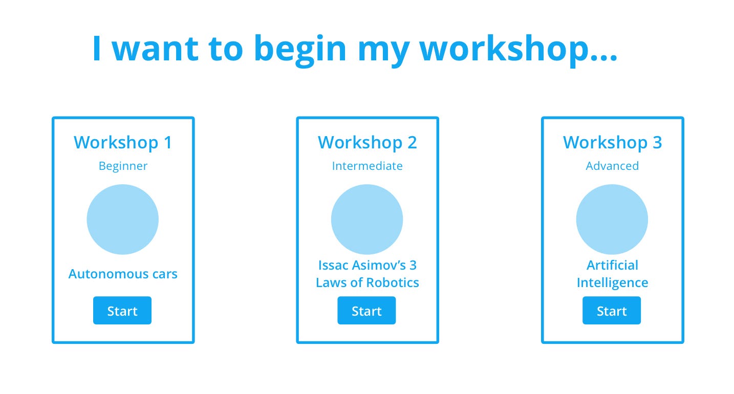
- Find a 1 day online workshop (Autonomous Cars) on robotics for a 15-year-old
- Using another method, find a coding 12-week course for a 11-year-old child and find out information on the syllabus
- Proceed to register for the course
Results
Iterations
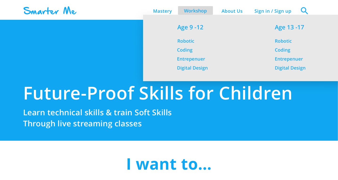
- Adding sticky navigation
2. Indicate for each workshop
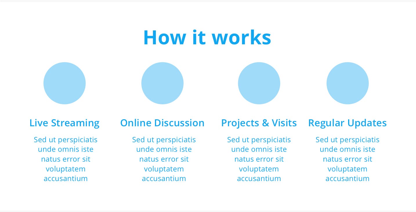
3. A section to showcase how live streaming is conducted
4. Rename ‘Mini-Master’ to ‘Mastery’ and ‘Quest’ to ‘Workshops’
Content strategy
To get more sign-ups for courses, Smarter Me must provide information on how classes are relevant, interactive, and fun, to make students and parents feel excited about being part of the course.
Conclusion
The team have list out possible ways Smarter Me can adopt to on their new website by changing their mini master to mastery, having sticky navigation to ensure users are always on the same page and provide content strategy to market their mastery class. The company may still want to reach out to parents and create awareness on the digital lesson both benefits and tackling cyberbully.


/https%3A%2F%2Fgame-tool.rocks%2Fimg%2Fh3.png)
